

Mindful Therapy
Partner: Lighthouse Health and Wellness
My Role: UX/ UI | Research
Date: Winter 2025
Tools: Figma
01 | Project Summary
Lighthouse Health and Wellness exists to be a “beacon in the dark”—a trusted guide toward emotional wellbeing, especially for those historically left in the shadows. Their core services include psychotherapy modalities such as CBT, DBT, mindfulness-based approaches, and motivational interviewing, alongside psychiatric medication management. To ensure clinicians can focus fully on patient care, Lighthouse partners with Mindful Therapy Group for scheduling and billing support. They also collaborate with local community organizations like Black Merchants and MultiCare to expand their reach and amplify awareness.
At the heart of this project is Dr. Marissa Garrett (DNP, PMHNP-C), a psychiatric nurse practitioner and advocate for equity in care. In our stakeholder meetings, Dr. Garrett emphasized two pressing needs: (1) reducing the stigma surrounding mental health—particularly in Black and POC communities—and (2) redesigning the website to be more culturally responsive, intuitive, and welcoming to younger audiences.


02 | The Problem
Many POC individuals hesitate to seek mental health care due to:
-
Lack of cultural representation among providers
-
Misinformation or limited understanding of therapeutic care
-
Barriers in navigation
-
Stigma, especially within communities of color
My challenge: How might I design an inclusive digital experience that promotes trust, reduces stigma, and makes it easier to access care?

03 | Design & Iteration
Before we built it, we looked at what the Lighthouse already had. It wasn’t bad—but it was too text-heavy, with unclear navigation and no emotional warmth. There was no clear space that said, “Hey. You’re safe here.” I knew we could bring that softness in while still keeping it structured.
Round 1: Initial Concepts
The Original Site

Next, is a peek at the initial wireframe. This was where we asked: How do we guide someone who’s nervous, maybe even scared, through their first steps toward care? Thus, I didn’t want them to get lost—I wanted them to feel held.
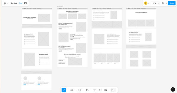
The Wireframe
Feedback: Dr. Garrett wanted warmer visuals and a clearer sense of cultural representation.
Round 2: Refinement
And this is where we landed.
Warm colors. Inclusive imagery. Clear headings. And a “Find a Therapist” portal—fully filterable by language, specialty, and therapeutic approach. We also introduced a “Community Engagement” section, featuring real testimonials, videos, and even user-submitted artwork—because healing often begins with seeing someone else make it through.
My primary contributions included designing and building the “Find a Therapist” page from the ground up, as well as editing the other pages to ensure consistency in color scheme, layout, and visual cohesion.

Round 3: Usability Testing
We conducted usability tests with eight participants, assigning them tasks designed to evaluate our prototype’s design and identify potential usability issues.
Here’s what they loved:
Visual Appeal & Inclusivity
Participants described the site as calming, welcoming, and visually engaging. The soft color palette and inclusive imagery made users feel emotionally safe and seen.
Community Engagement Page
This section stood out for many users. They appreciated the therapist testimonials, video stories, and original artwork, noting that these elements built a sense of trust and authenticity.
Ease of Navigation
Once oriented, most users moved through the site smoothly. They found the layout intuitive and appreciated how clearly information was organized.

Here’s what didn’t work:
Insurance Information Visibility
Multiple users had difficulty locating details about accepted insurance providers. Many assumed this information would be clearly listed on the homepage, About Us page, or within a dedicated insurance tab—leading to unnecessary confusion.
Crisis Support Placement
The 988 hotline and other emergency resources weren’t immediately visible to users. Several participants suggested relocating these critical links.
Navigation Confusion
Some users found it challenging to locate culturally-tailored care resources. One tester noted there was no clearly labeled section, which made it harder to identify content specific to their needs or background.
So here’s what I would improve:
Insurance Info
Create a clearly labeled “Insurance & Payment” tab. Add a quick summary of top accepted providers to the homepage for faster visibility.
Menu Clarity
Add or rename a section to clearly indicate “Culturally-Tailored Care.” This ensures users from diverse backgrounds can easily find relevant support.
Enhance Navigation
Refine the site’s information hierarchy so that new users can reach key services—like therapy intake and FAQs—in fewer clicks.
Appointment Scheduling
Relocate the “Book Session” button to a more prominent area and ensure it works reliably across devices. This minimizes frustration and improves conversion.
08 | Reflection
This project deepened my understanding of intersectional access to care and helped reaffirmed the power of empathetic design. Seemingly small choices—like language, imagery, or layout—had a impact on how welcomed users felt while navigating the site. I’ve come to appreciate designing for these quiet moments of recognition, where a first-time or returning visitor could feels seen, supported, and held by the interface itself.
If I were to continue iterating, I would take a more hands-on approach in implementing user feedback. I’d also develop additional documentation to clearly articulate my team’s design intentions—such as resource guides, embedded support tips, or pinned information boards tailored to the mental health needs of Black and POC users. With a stakeholder as open and responsive as Dr. Garrett, there’s real potential to further expand the platform’s offerings in meaningful, community-driven ways.

